

By Dr. Geeta Rawat
Department of Geography, Shri Guru Ram Rai (SGRR) University, Dehradun
If you follow international headlines, you may have seen viral posts claiming: “The UN has officially changed the world map!”
But what does this actually mean?
Did the Earth change shape? Did countries gain new borders?
The short answer is no. The United Nations has not changed national borders or the political map of the world. Instead, it has adopted a non-binding resolution encouraging greater use of map projections that represent the relative size of continents more accurately.
This is important because every world map is a representation of our round planet on a flat surface. The way that representation is created can make some countries and continents appear larger or smaller than they really are
Here is a straightforward guide to what the United Nations General Assembly decided, why the Mercator projection has been debated for centuries and how the Equal Earth projection offers an alternative for representing the world’s contine
What Happened at the United Nations?
On 4 September 2026, the United Nations General Assembly adopted a resolution titled “Correct the Map: Rebalancing Global Cartographic Representation and Promoting Equitable Representation of the World’s Regions, Particularly Africa”. The initiative was led by Togo and supported by the African Union.
The Vote
The resolution was adopted with:
- 164 countries voting in favour
- 1 country voting against — the United States
- 6 countries abstaining
The resolution is non-binding, which means it does not impose a legal requirement on countries to replace one map projection with another.
What Does the Resolution Recommend?
The resolution encourages governments, schools, international organisations and technology companies to consider equal-area map projections, including the Equal Earth projection, particularly when the relative size of continents is important.
It does not make Equal Earth the only acceptable world map. Different map projections have different purposes and remain useful in different situations. The resolution also does not alter national borders, sovereignty or territorial claims.
Most importantly, the UN has not “redrawn” the Earth. It is encouraging a reconsideration of how the world is visually represented.
The Orange Peel Problem: Why Do World Maps Look Different?
here is a simple problem at the heart of cartography:
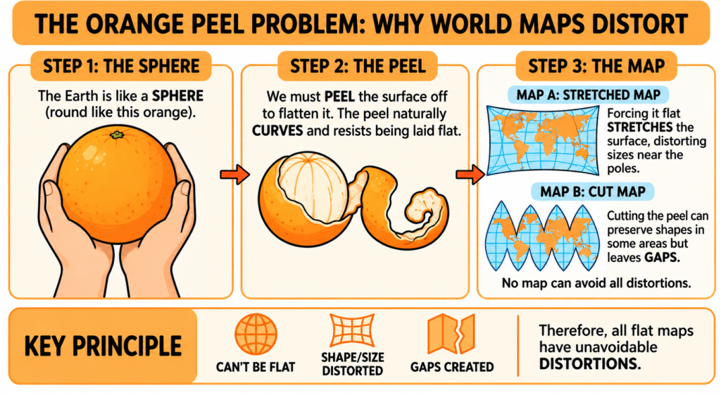
You cannot flatten a three-dimensional globe onto a two-dimensional sheet of paper without introducing some distortion.
Imagine peeling an orange and trying to press the peel completely flat on a table. You would have to stretch, tear or reshape parts of it.
The same basic problem occurs when cartographers create a flat map of the Earth.
To solve this problem, cartographers use mathematical systems called map projections. Every projection involves compromises. Depending on its purpose, a projection may aim to preserve:
- Area — the relative size of regions
- Shape — particularly local angles and forms
- Distance — how accurately distances are represented
- Direction — how accurately bearings are shown
No single flat world map can preserve all four properties perfectly at the same time.
That is why there is no single “perfect” world map. The best projection depends on what the map is being used for.
What Is the Mercator Projection?
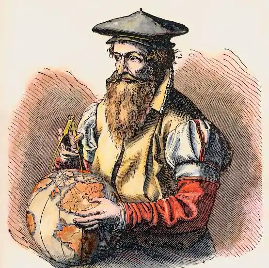
The Mercator projection was developed by the Flemish cartographer Gerardus Mercator and published in 1569. It was designed to solve an important practical problem: navigation.
One of its most useful properties is that a straight line on a Mercator chart represents a constant compass bearing, known as a rhumb line or loxodrome. This made the projection extremely valuable to sailors plotting courses across oceans.
However, this useful property comes with a major trade-off.
The Problem of Area Distortion
The Mercator projection increasingly enlarges landmasses as they move away from the Equator towards the poles.
This can create a very misleading impression of the relative size of countries and continents.
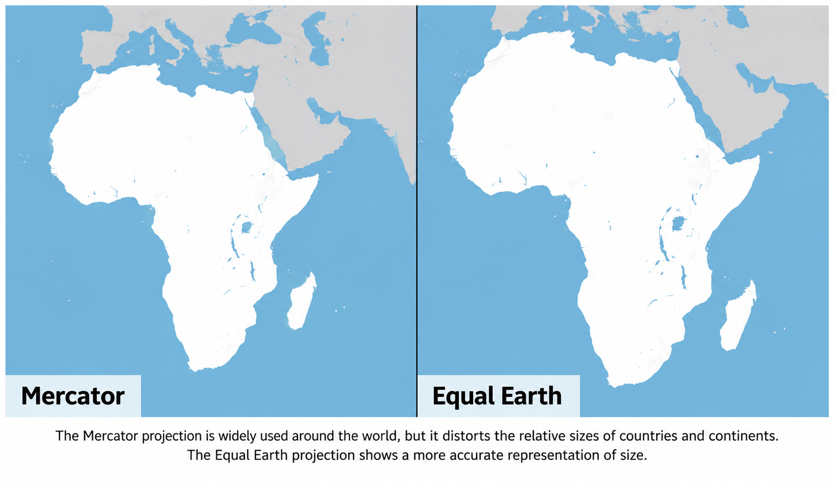
Africa vs Greenland
A familiar example is the comparison between Africa and Greenland.
On a standard Mercator world map, Greenland can appear almost comparable in size to Africa. In reality, Africa is approximately 14 times larger than Greenland.
The problem is not that Mercator calculates Africa’s area incorrectly. Rather, its mathematical design causes high-latitude regions to appear much larger on the map than their actual area.
Northern Europe, North America and other regions at higher latitudes are similarly enlarged relative to regions closer to the Equator.
This is one reason the Mercator projection has generated a long-running debate about how maps influence people’s understanding of the world.
Enter the Equal Earth Projection
An important alternative is the Equal Earth projection.
The Equal Earth projection was developed in 2018 by cartographers Bojan Šavrič, Tom Patterson and Bernhard Jenny. It is an equal-area pseudocylindrical projection designed specifically for world maps.
Its most important feature is simple:
Areas are represented in their correct relative proportions.
This means that Africa does not need to be visually enlarged to compensate for distortion elsewhere. Instead, continents are shown according to their actual relative areas.
Equal Earth was inspired in part by the widely used Robinson projection. However, unlike the Robinson projection, Equal Earth preserves the relative size of areas while aiming to maintain visually balanced continental shapes.
| Feature | Mercator Projection | Equal Earth Projection |
| Developed | 16th century | 2018 |
| Primary purpose | Navigation and bearing | World maps and thematic mapping |
| Area | Distorted, especially towards the poles | Preserves relative area |
| Polar regions | Greatly enlarged | Represented without Mercator’s extreme enlargement |
| Continental appearance | Increasing distortion towards the poles | More proportionally balanced |
| Best suited for | Navigation and certain local or regional maps | Education, atlases and thematic world maps |
The important point is that Equal Earth does not make Africa “larger”. Instead, it removes the strong enlargement of high-latitude regions produced by Mercator.
Why Does This Matter for Geography Students?
For students studying geography, cartography, GIS and competitive examinations, the debate over world map projections offers several useful lessons.
Maps are tools chosen for a purpose
A map should not simply be labelled “right” or “wrong”. Students should ask:
What is this map designed to show?
For example, an equal-area projection is particularly useful when comparing the sizes of countries, continents or other geographical areas. A conformal projection such as Mercator can be useful when accurate local angles and bearings are important.
Maps influence visual understanding
Cartography is not merely about drawing countries on a page. The projection selected by a cartographer affects how geographical information is seen and interpreted.
When a continent is consistently shown much smaller relative to other regions than its actual area, it can influence people’s mental picture of the world.
This is one reason the UN resolution places particular emphasis on education and accurate representation.
Cartographic accuracy depends on the purpose
There is no projection that is perfect for every application.
A navigation chart may require properties that make Mercator useful. A map comparing the areas of continents or displaying global environmental data may benefit from an equal-area projection.
Therefore, good cartographic practice means choosing the projection according to the purpose of the map.
Political borders have not changed
This is perhaps the most important point to remember.
The UN resolution concerns cartographic representation. It does not change the sovereignty, territorial status or internationally recognised borders of countries. The resolution does not redraw national boundaries simply because a different projection is used.
Conclusion: Has the UN Changed the World Map?
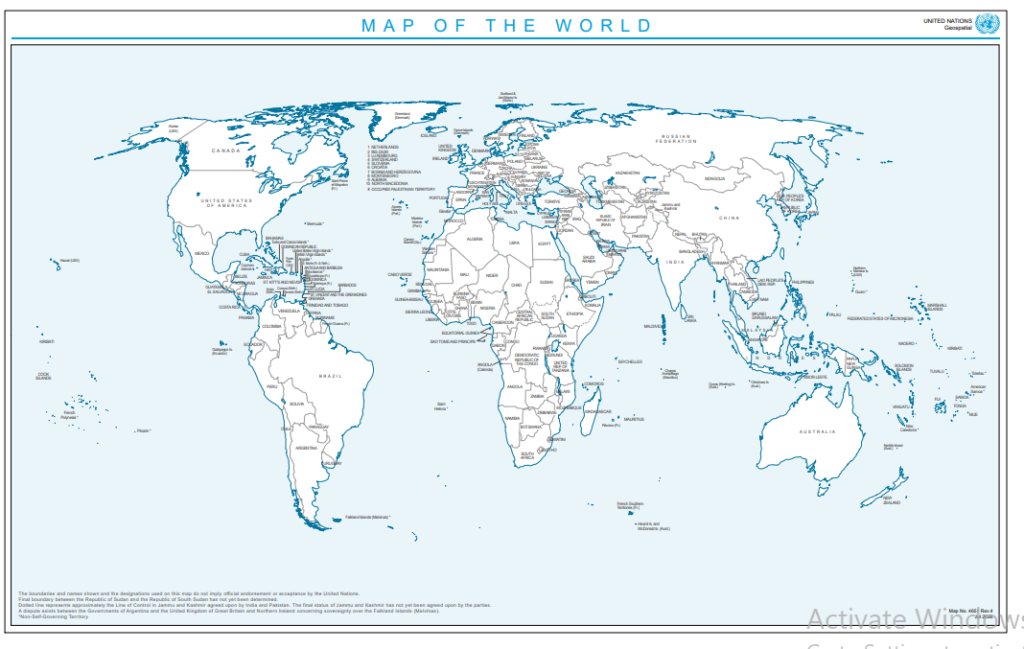
Note – above map is download from offical website of united nations – https://www.un.org/geospatial/content/map-world-1 for educational purpose
No. The UN has not changed the physical or political map of the world.
What has changed is the international conversation about how the world should be represented on maps.
The UN General Assembly’s adoption of the “Correct the Map” resolution has drawn attention to the limitations of traditional map projections and encouraged greater consideration of equal-area representations such as Equal Earth.
For students, the lesson goes beyond remembering the names of two projections.
The next time you look at a world map hanging on a classroom wall or displayed on a screen, ask yourself:
Which projection is being used, what does it preserve and what does it distort?
Understanding these questions is one of the first steps towards developing strong cartographic and geographical thinking.
Next time you look at the world map hanging on a wall or glowing on your tablet, check the projection name at the bottom corner. Learning to identify projection distortions is one of the first and most rewarding steps to thinking like a true geographer.
Dr. Geeta Rawat Ph.D. She is a renowned expert on geography and Uttarakhand culture. She has written several research papers on cultural geography and heritage conservation. His research interests include cultural heritage, geomorphology and geographic information systems.
Also read – Celebrating the Ghugitia Festival in Uttarakhand – 2025